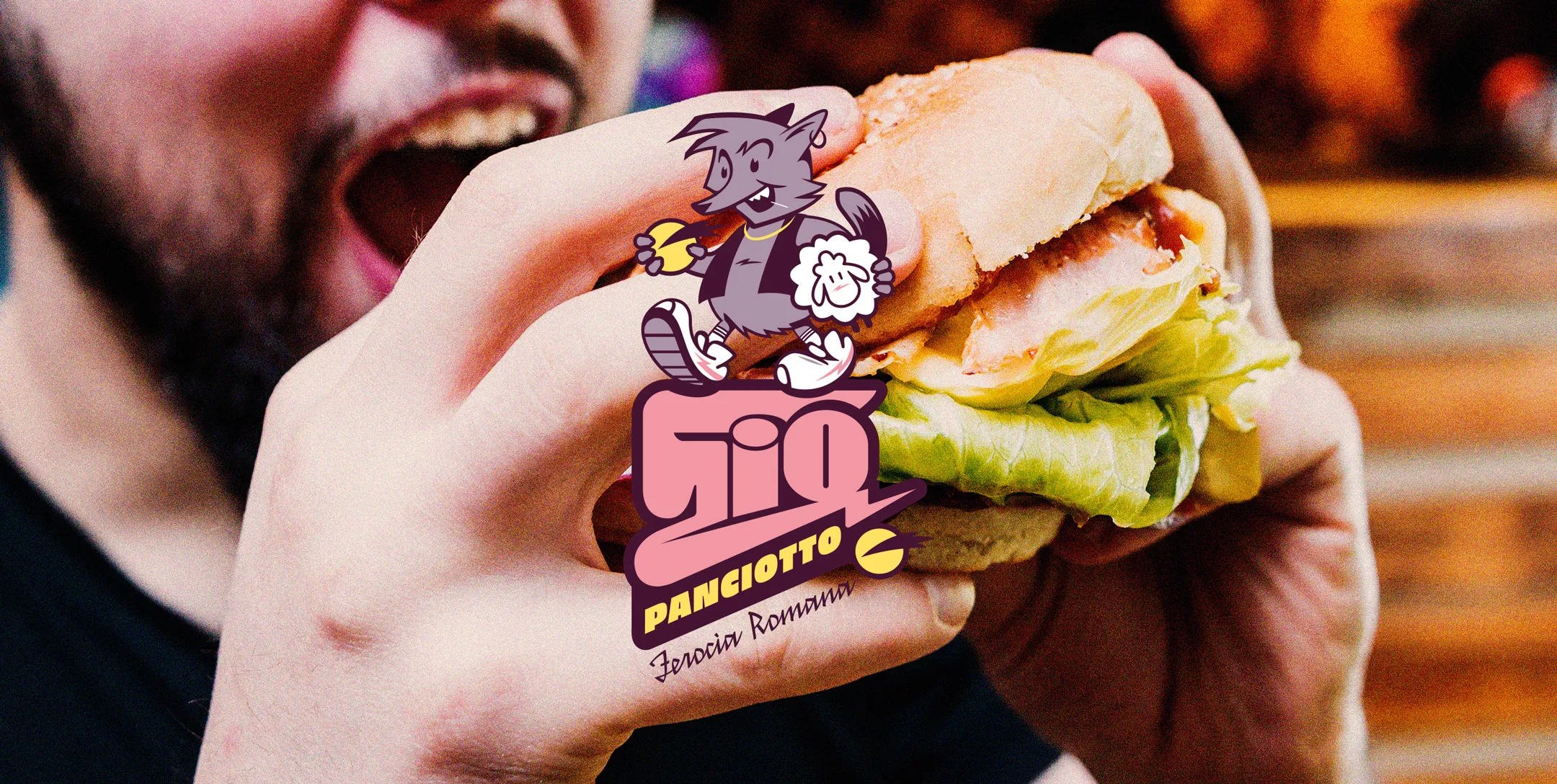
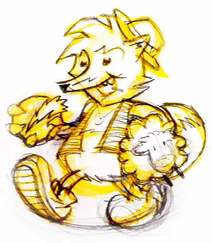
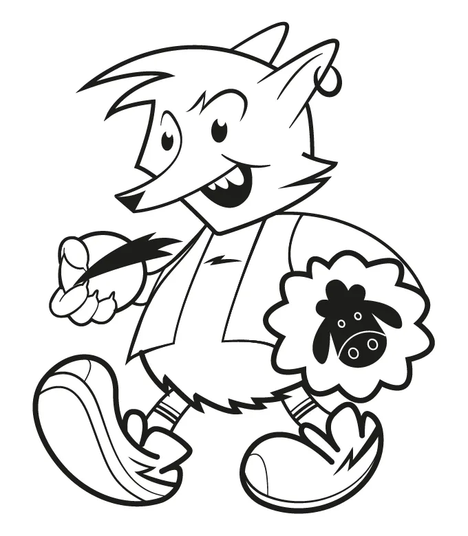
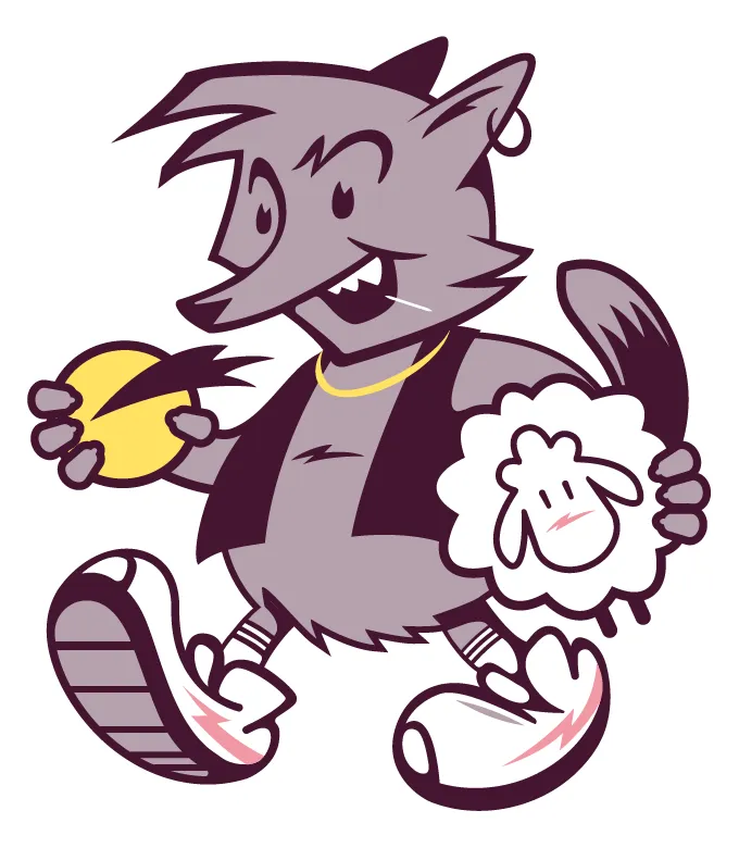
The challenge was to design an iconic and recognizable character that could convey the core values of the brand: energy, hunger (for food and life), Roman identity, and a strong visual attitude.
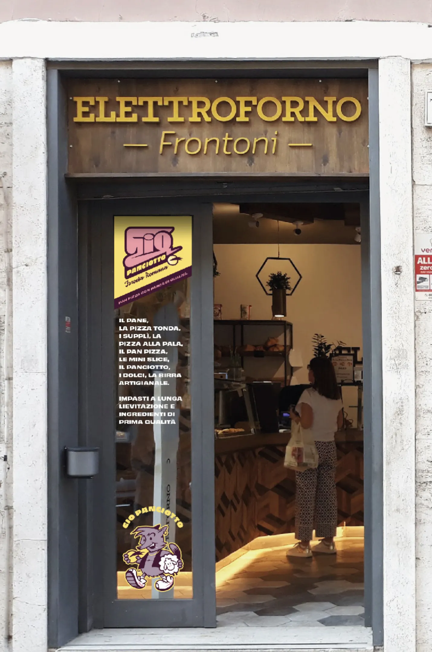
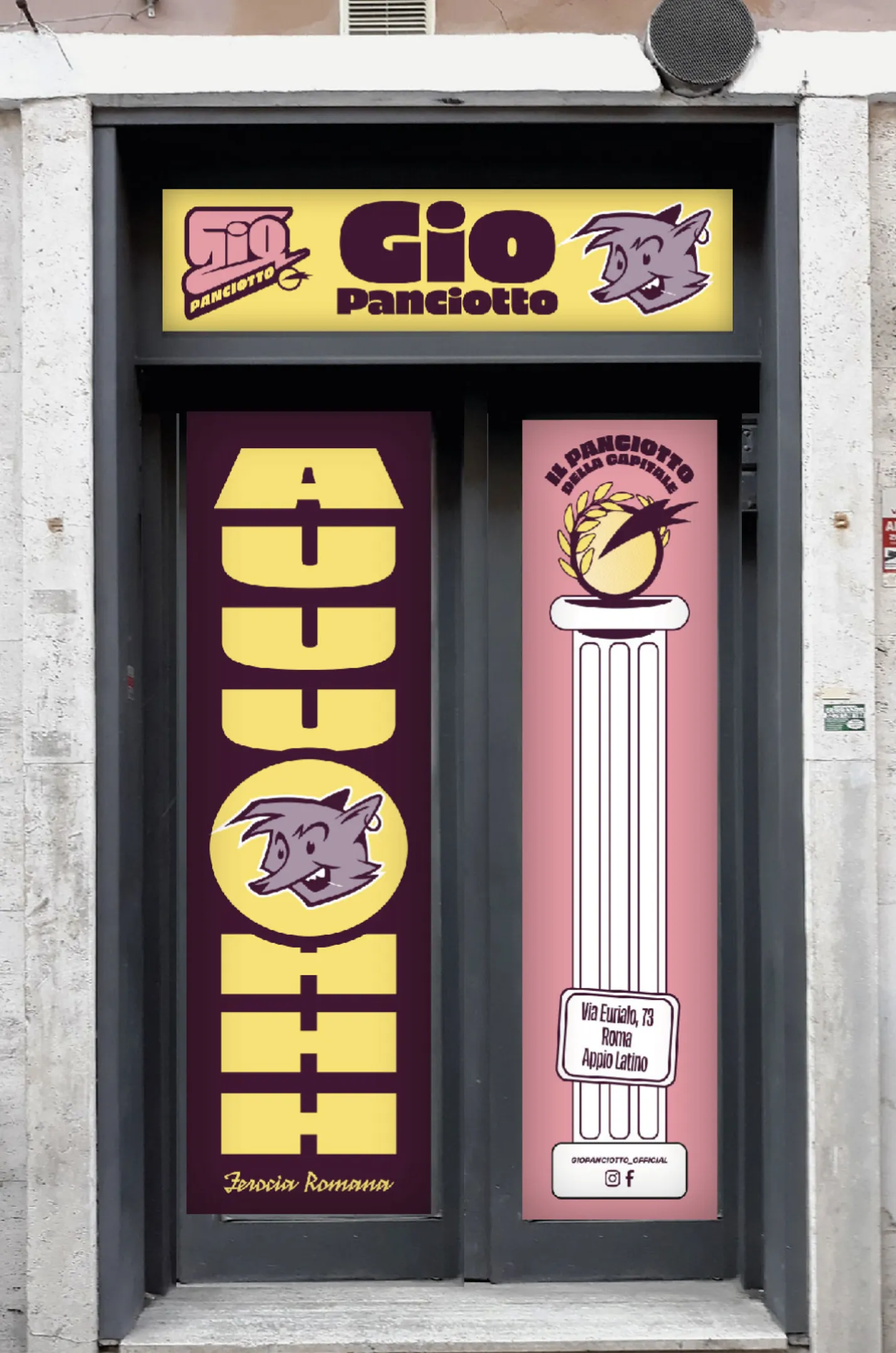
This is how Gio was born—a young urban wolf.
With a cheeky look, sharp lines, and a bold, confident style, Gio is more than just a mascot: he’s the visual ambassador of the entire project.

GRAPHIC LAYOUT
The color palette was designed to be tasty and pop, evoking a sense of fun and flavor, while subtly referencing traditional Roman aesthetics.
The logotype is bold and grounded, yet dynamic thanks to diagonal cuts and angular shapes that bring movement and energy—perfectly aligning with the fast-paced spirit of the concept.
The result is a cohesive visual system that speaks to a younger audience while staying true to its roots.