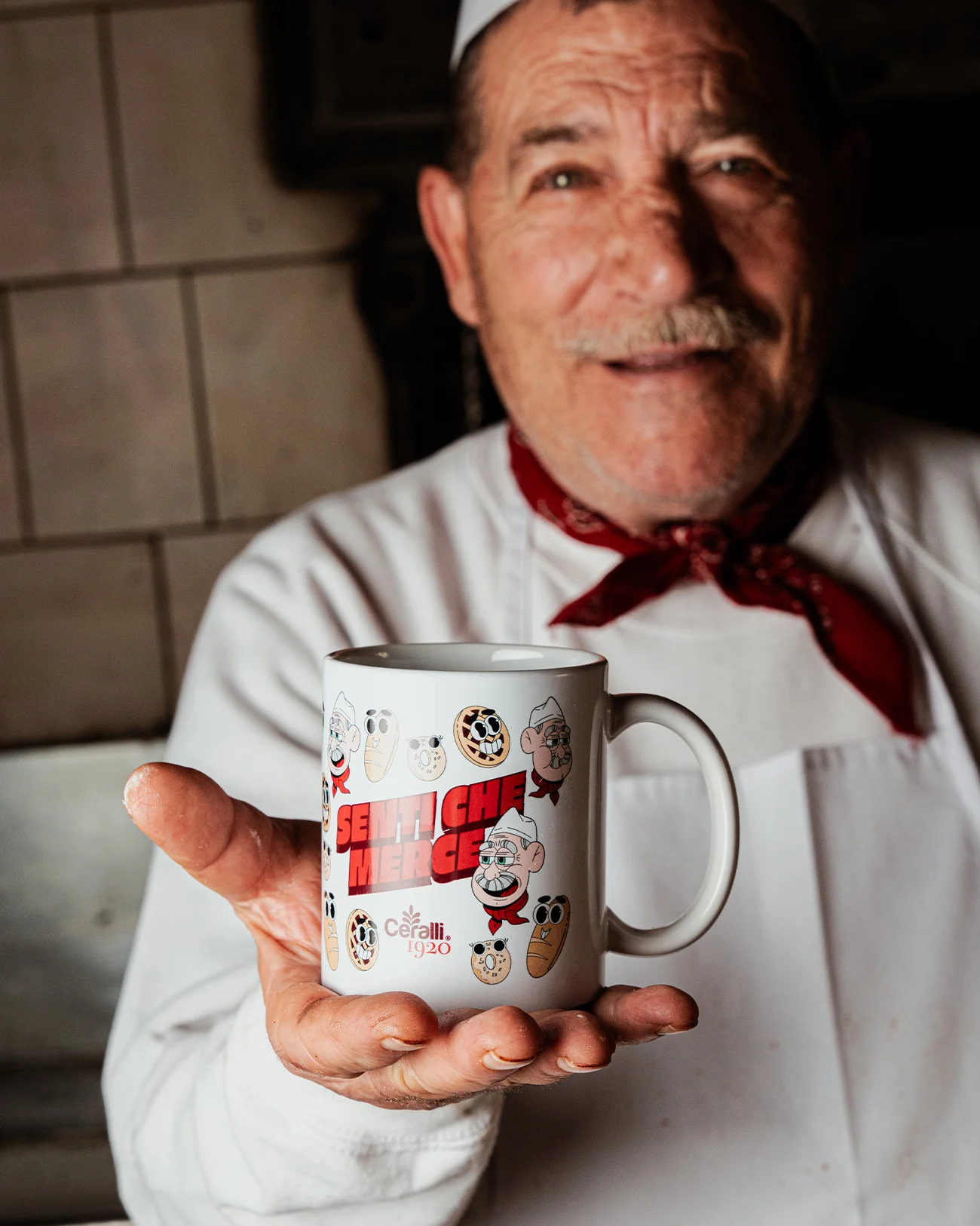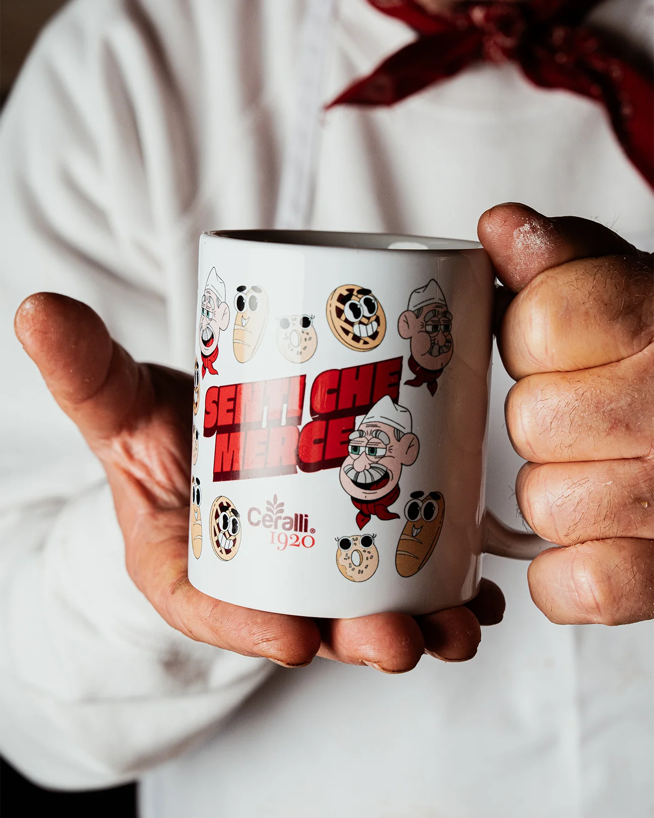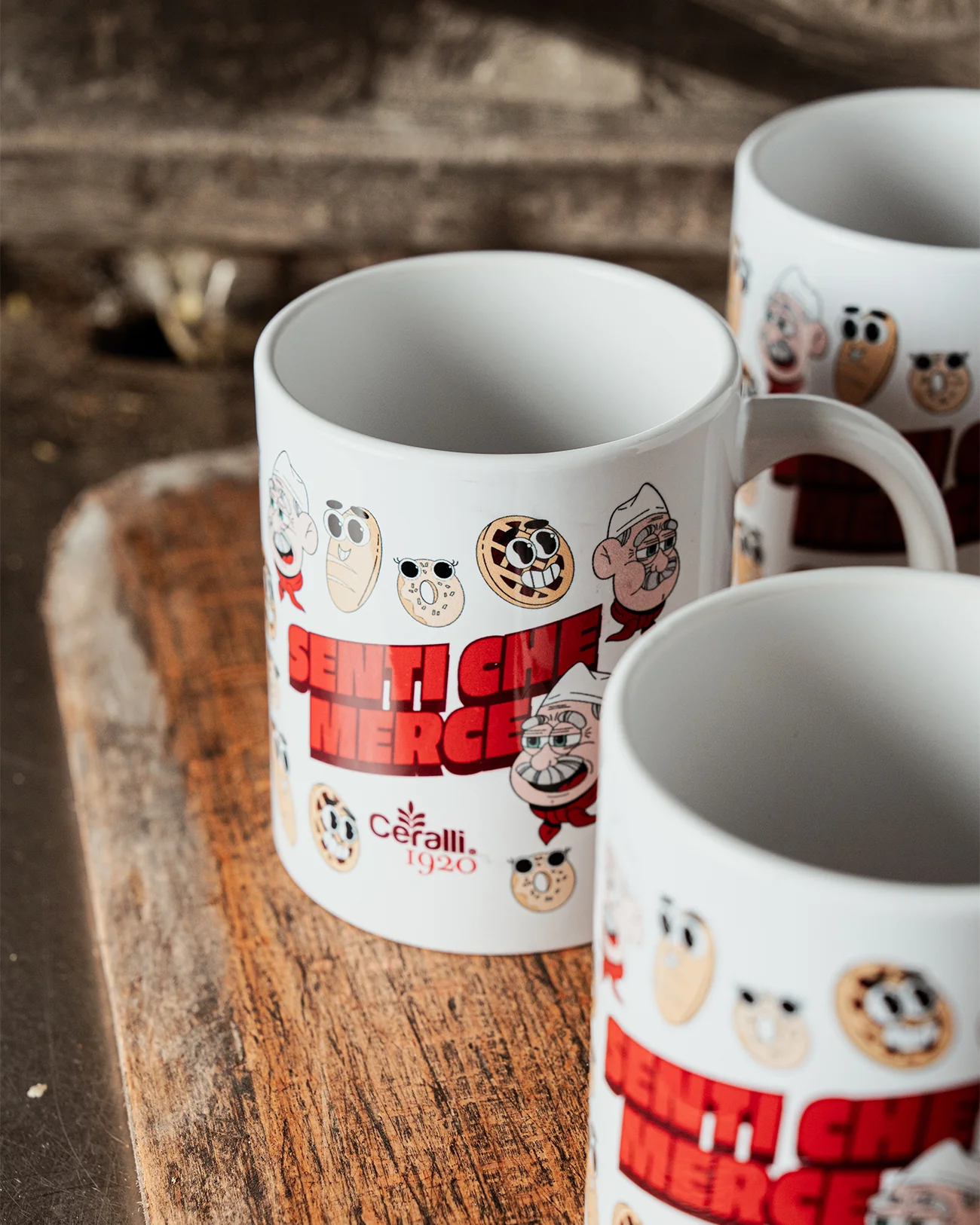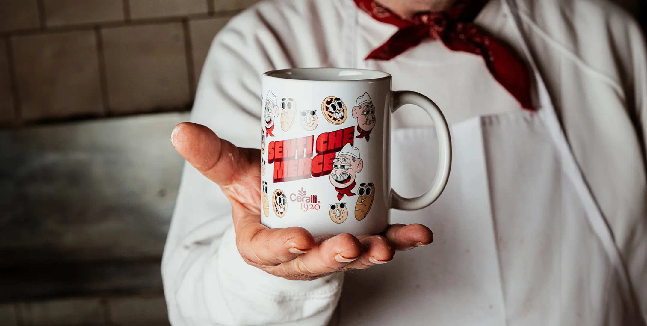


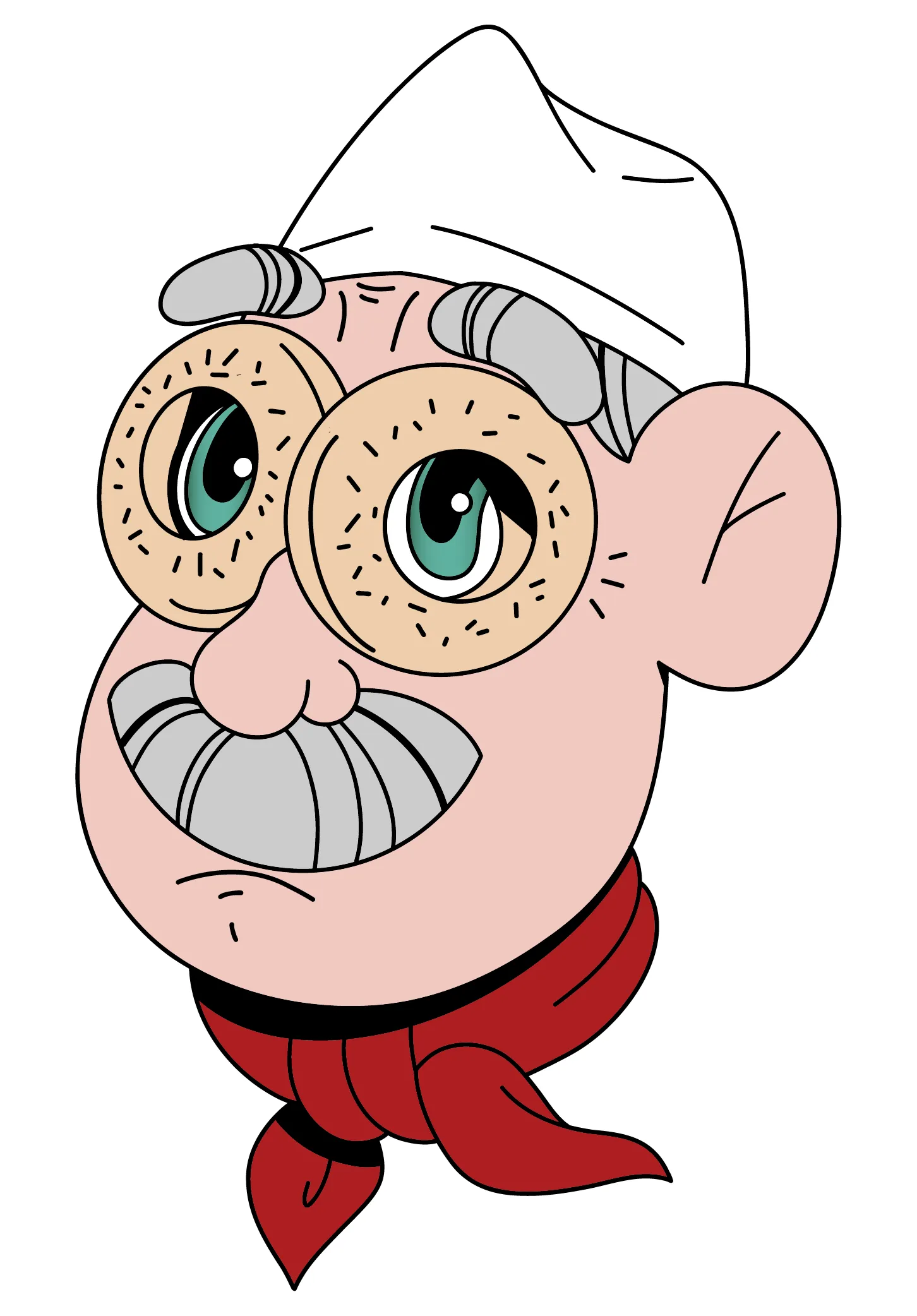


The style is playful and cartoon-like, with soft lines and flat colors that emphasize the characters’ personality. I created a set of illustrations featuring the owner in various expressions, alongside humanized versions of the bakery’s most iconic products, all brought to life with eyes and mouths. The mug’s layout features a dynamic collage of these elements surrounding the central “Senti che merce” lettering, which I custom designed in a bold style inspired by traditional Roman shop signs. The illustrations have also been used as stickers and on the bakery’s official website.