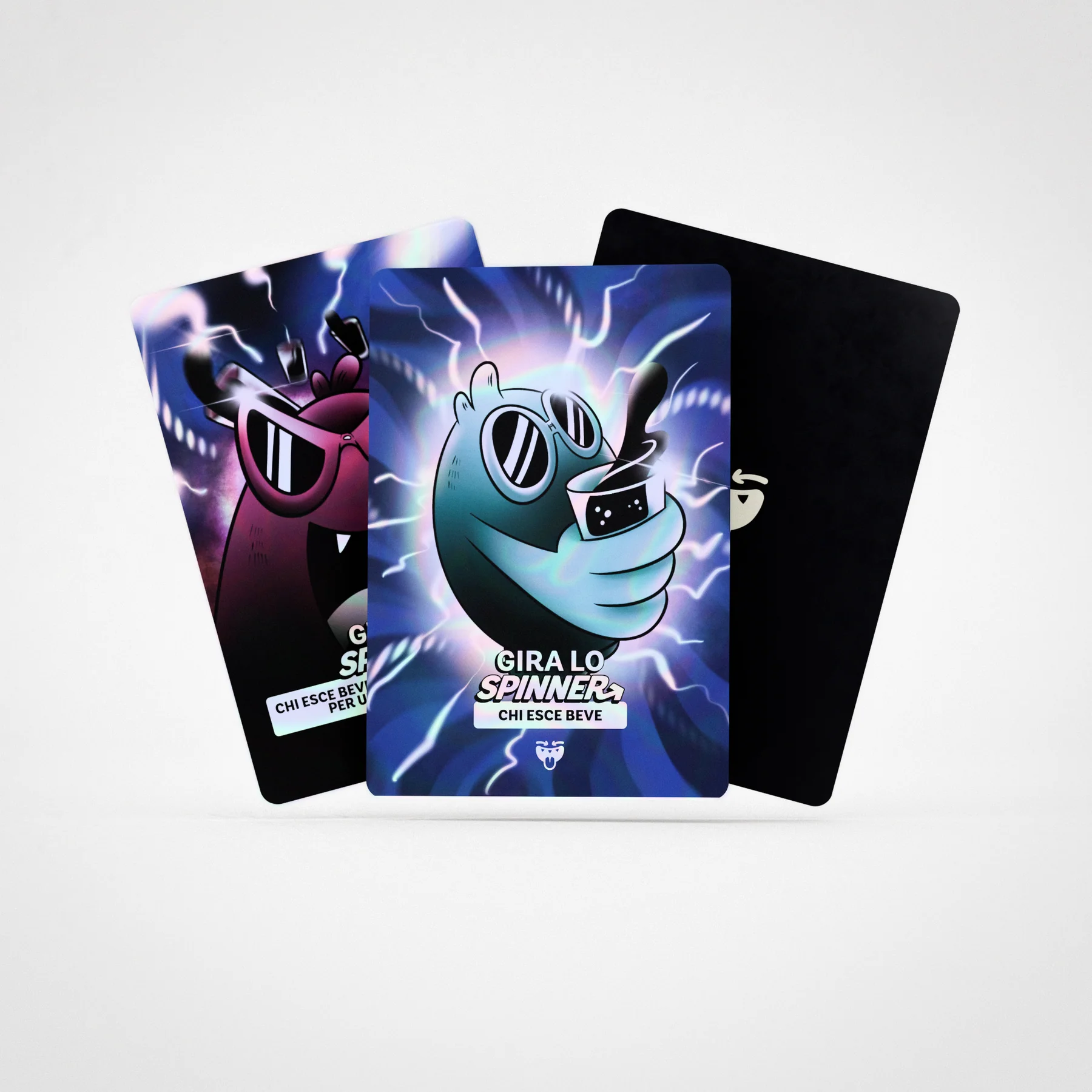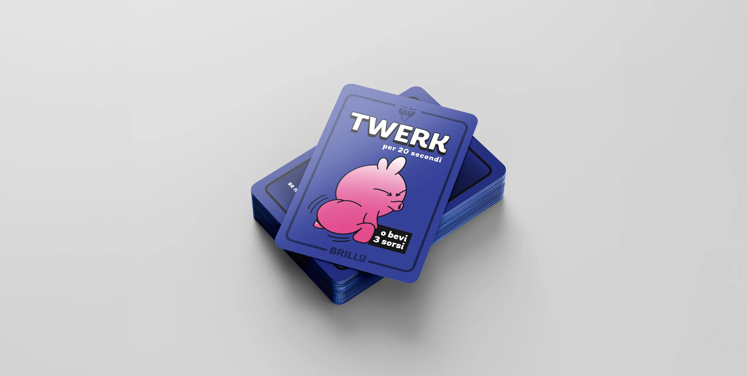
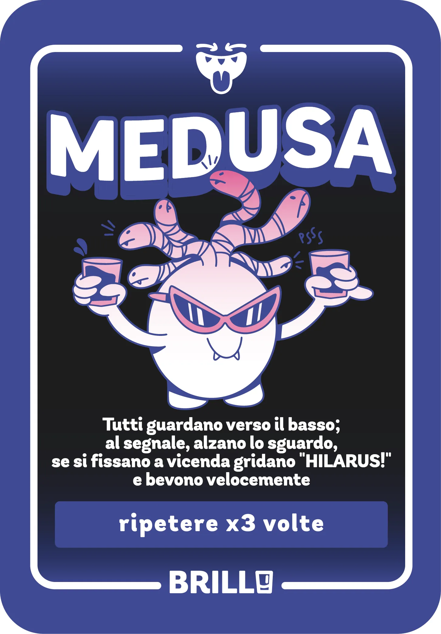
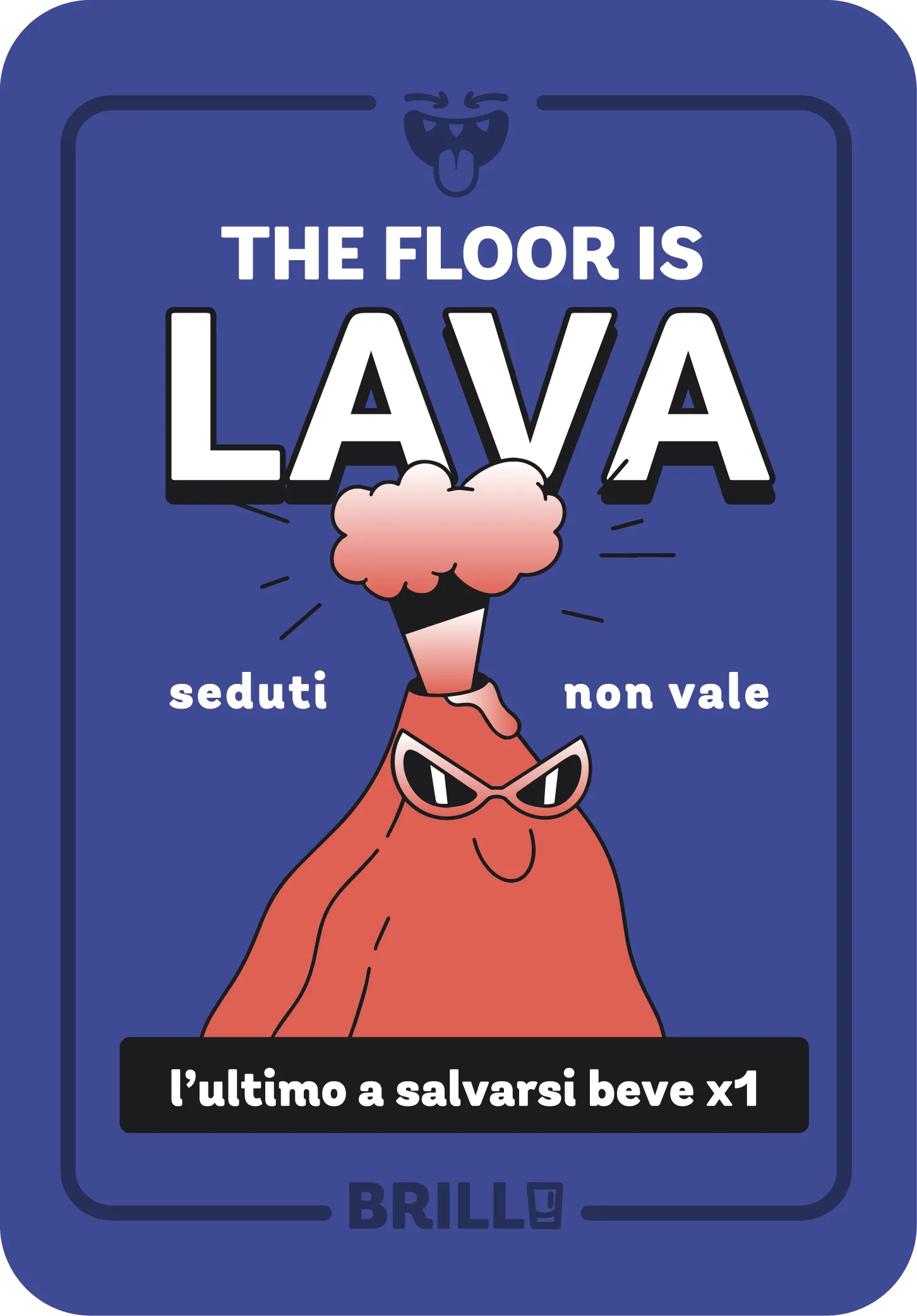
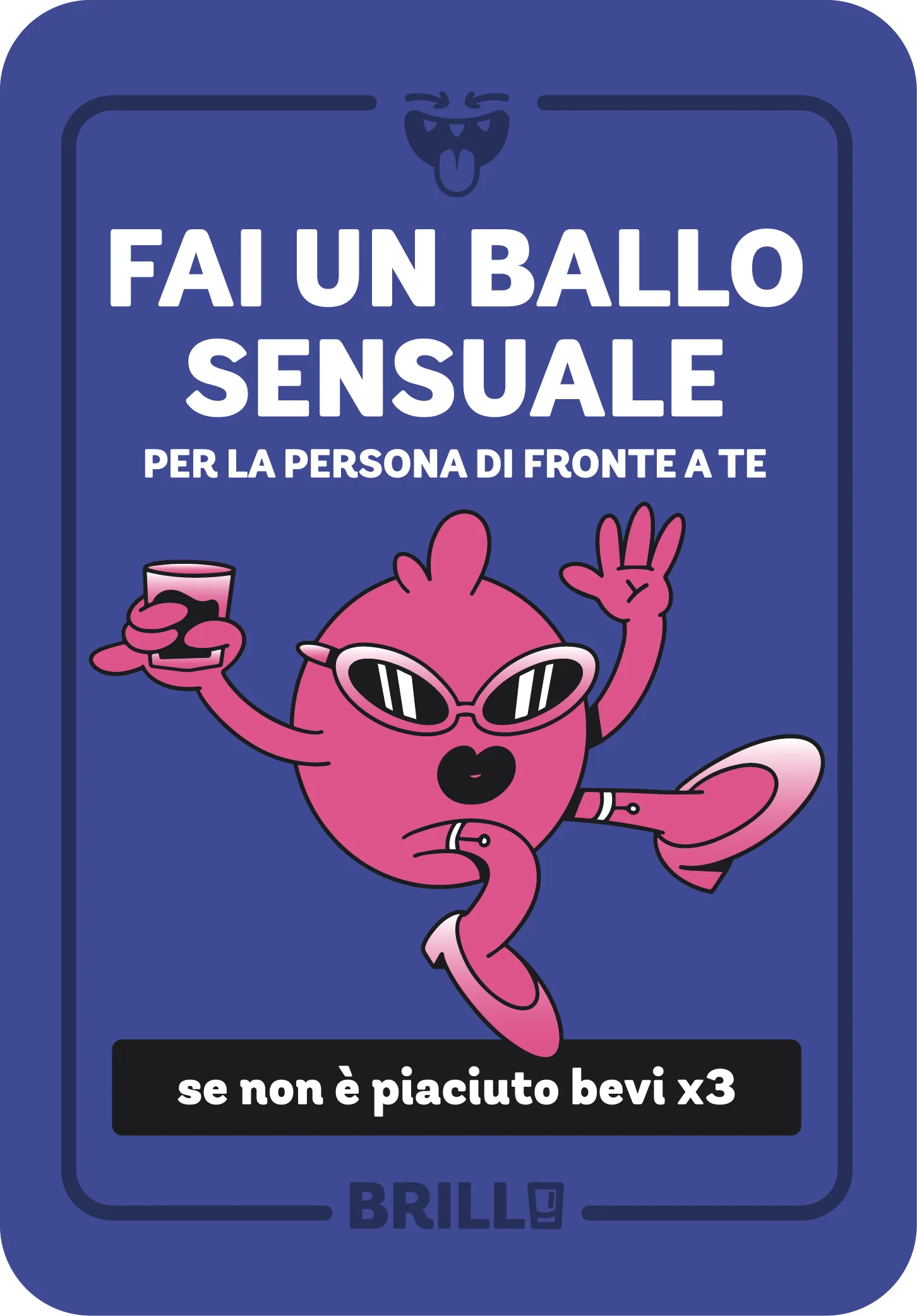
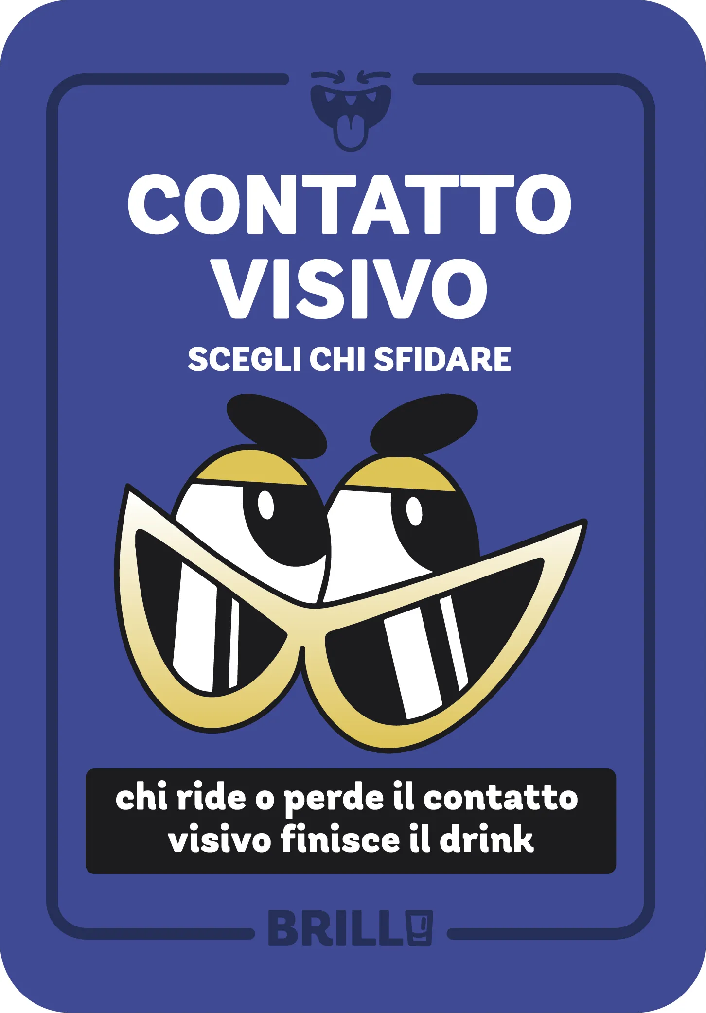
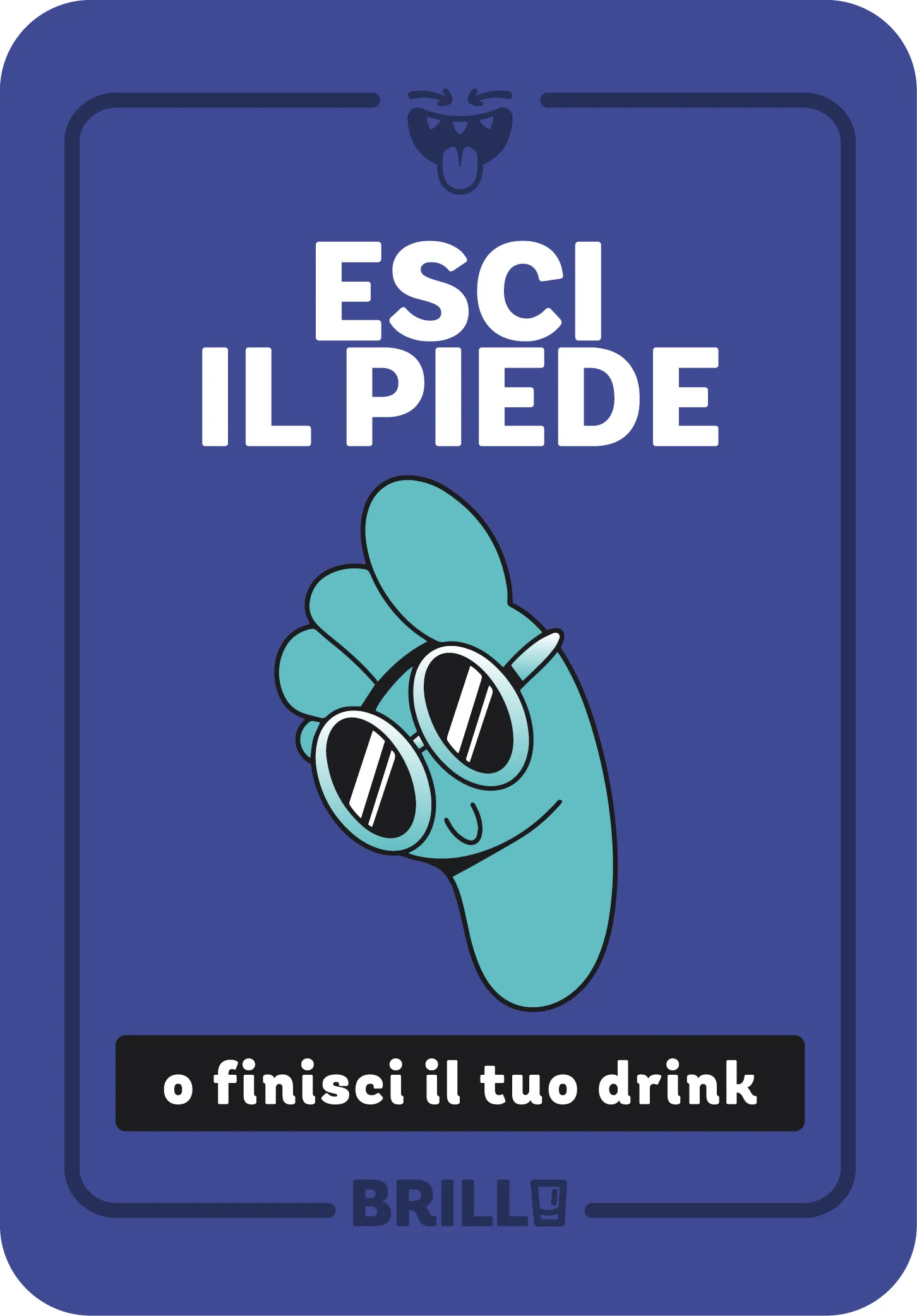
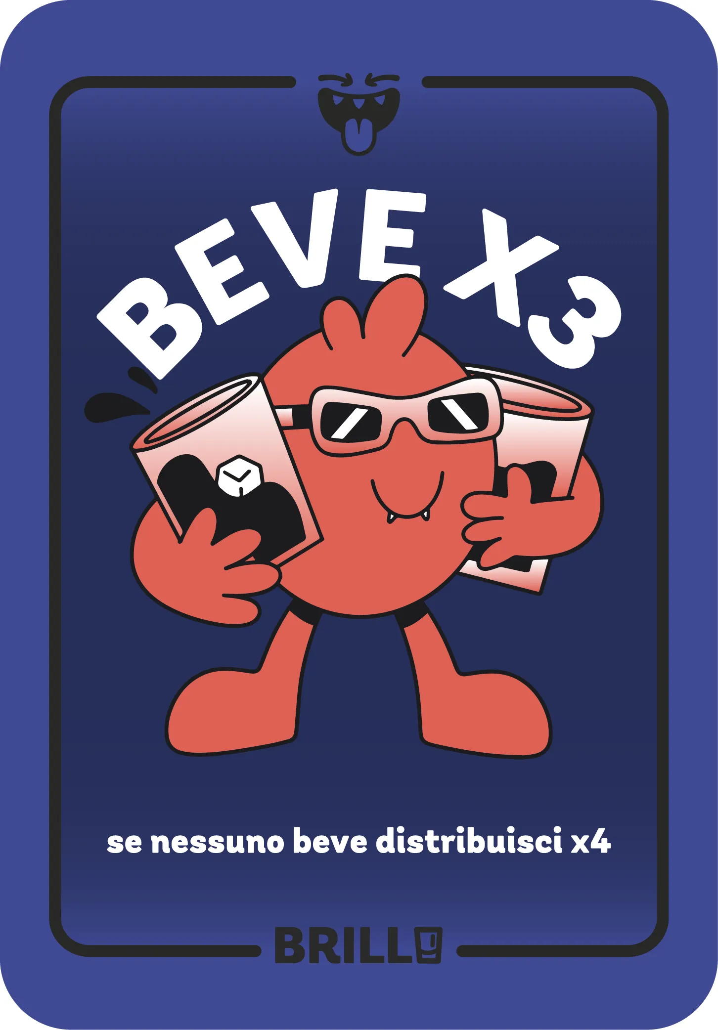
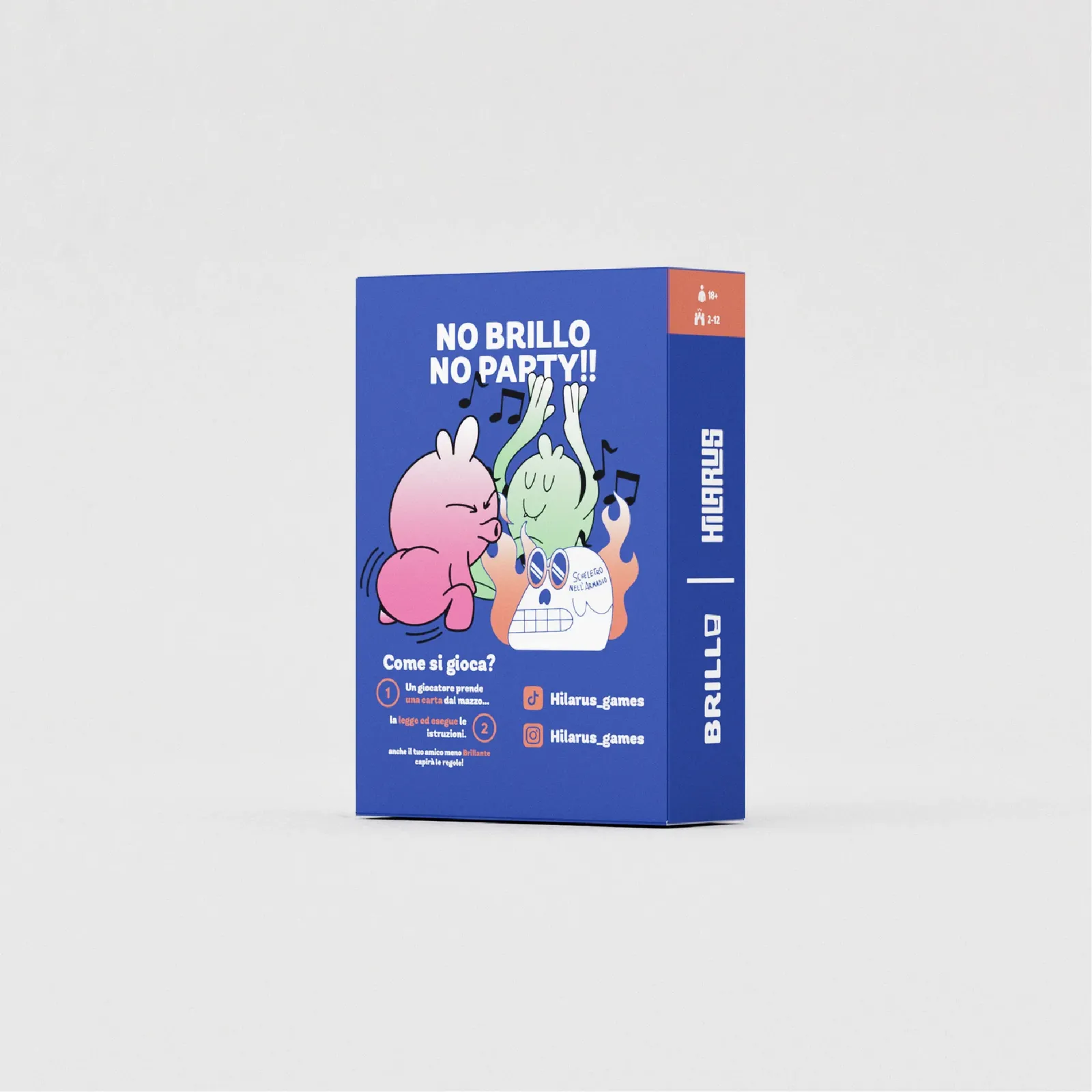
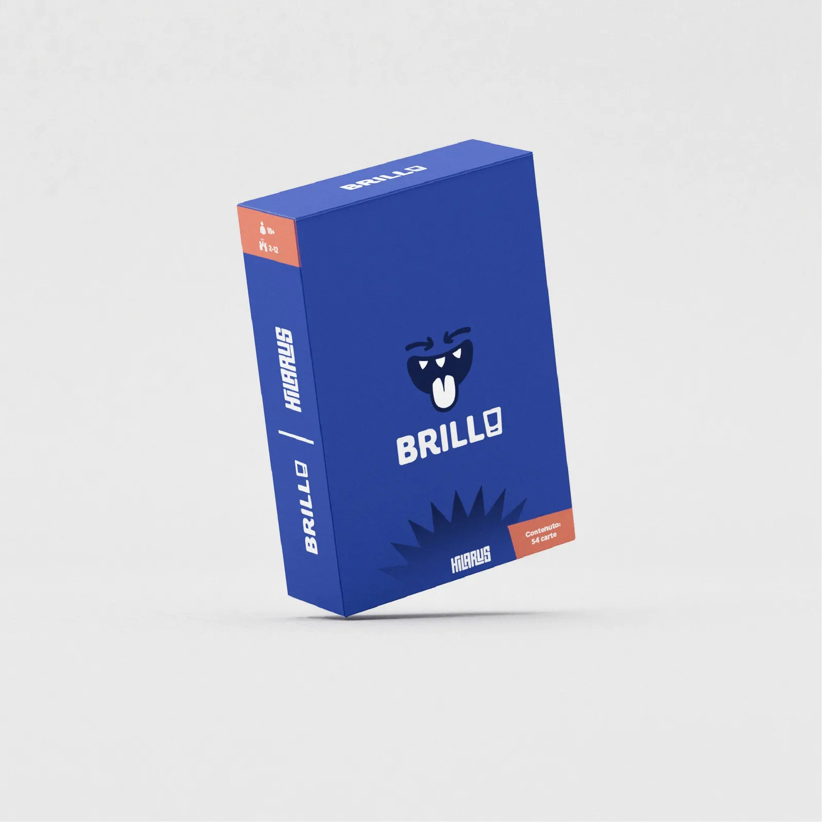
I created a character that would become the visual soul of the game: a mischievous little ghost, inspired by the brand’s logo (Hilaurs). Born in Brillo, this character laid the foundation for the entire series identity. I designed it to be expressive, playful, and constantly changing, shifting into different looks and moods with each card, while keeping a strong visual personality. It’s the perfect symbol of the game’s chaotic charm.

GRAPHIC LAYOUT
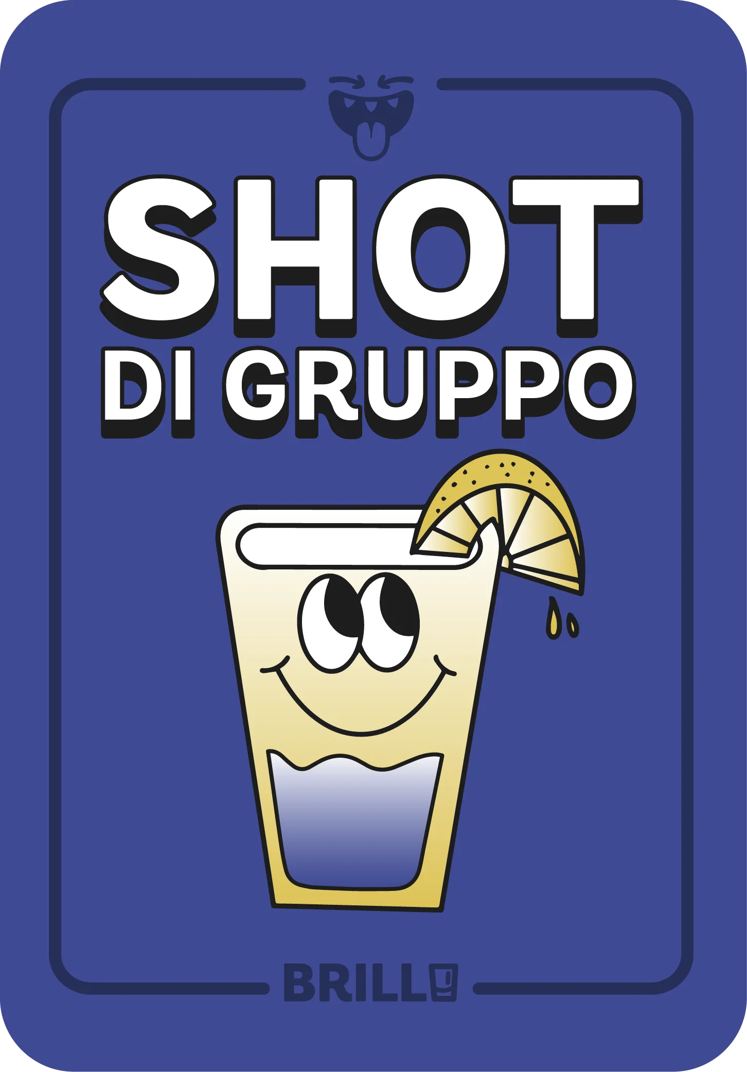
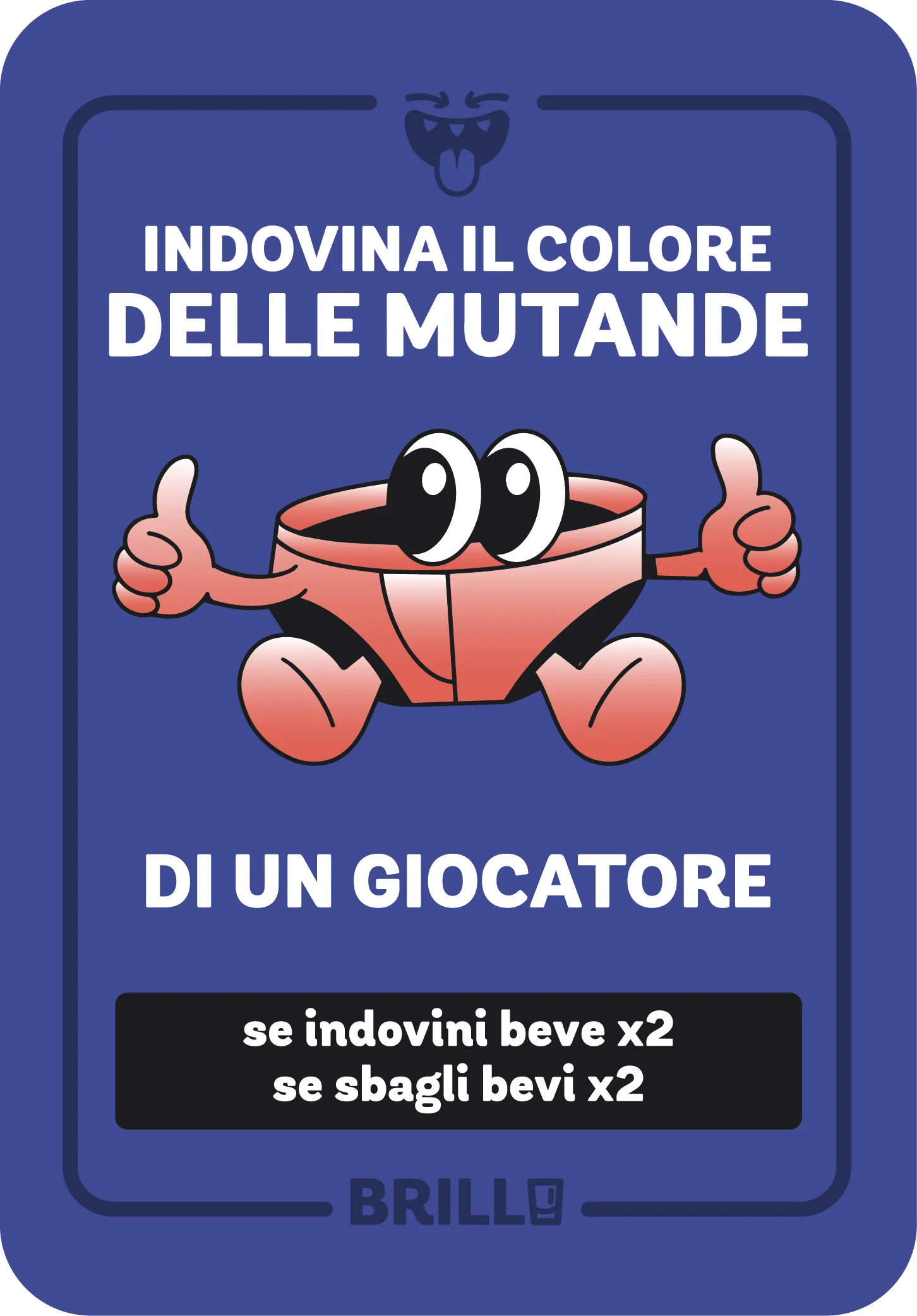
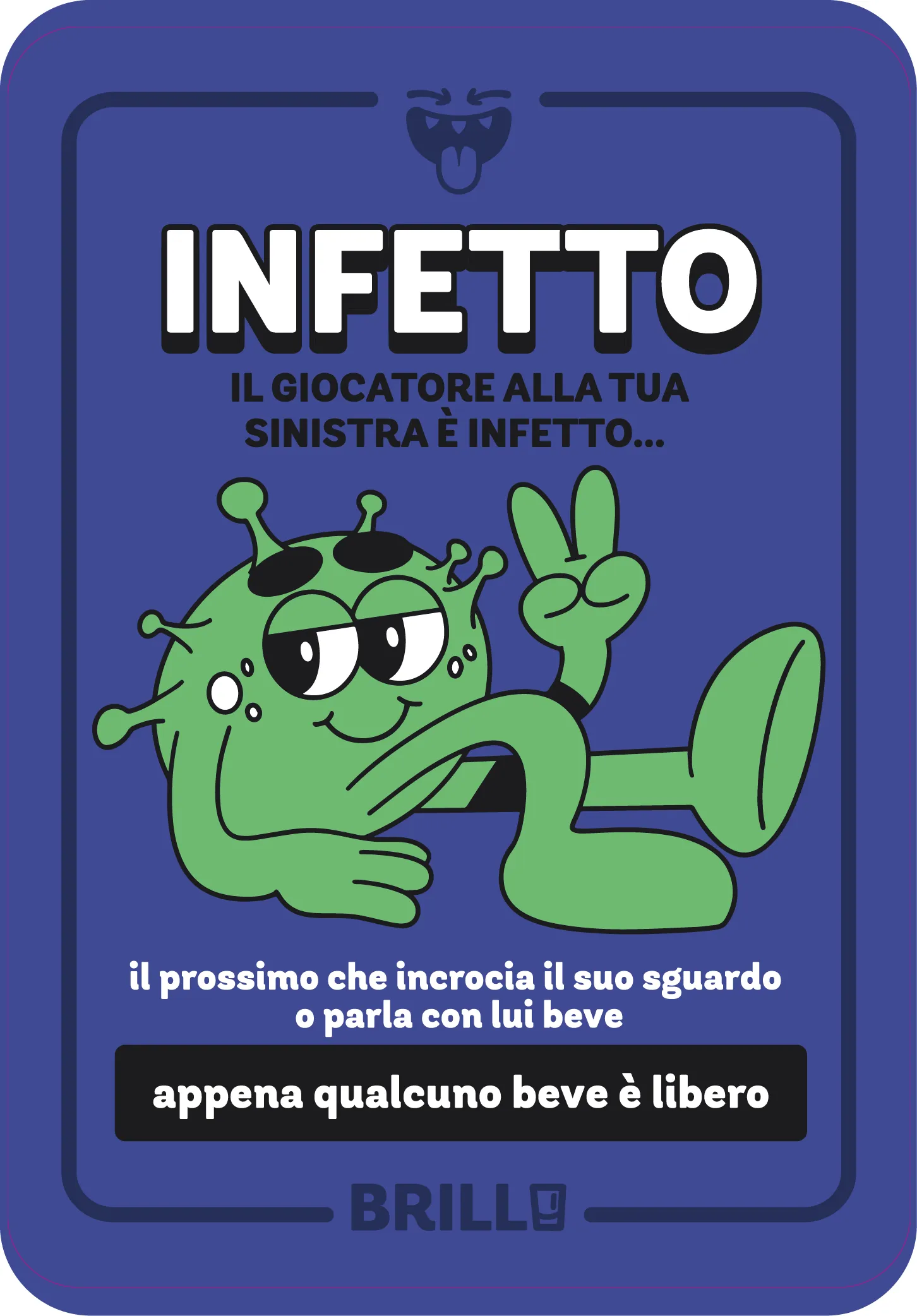
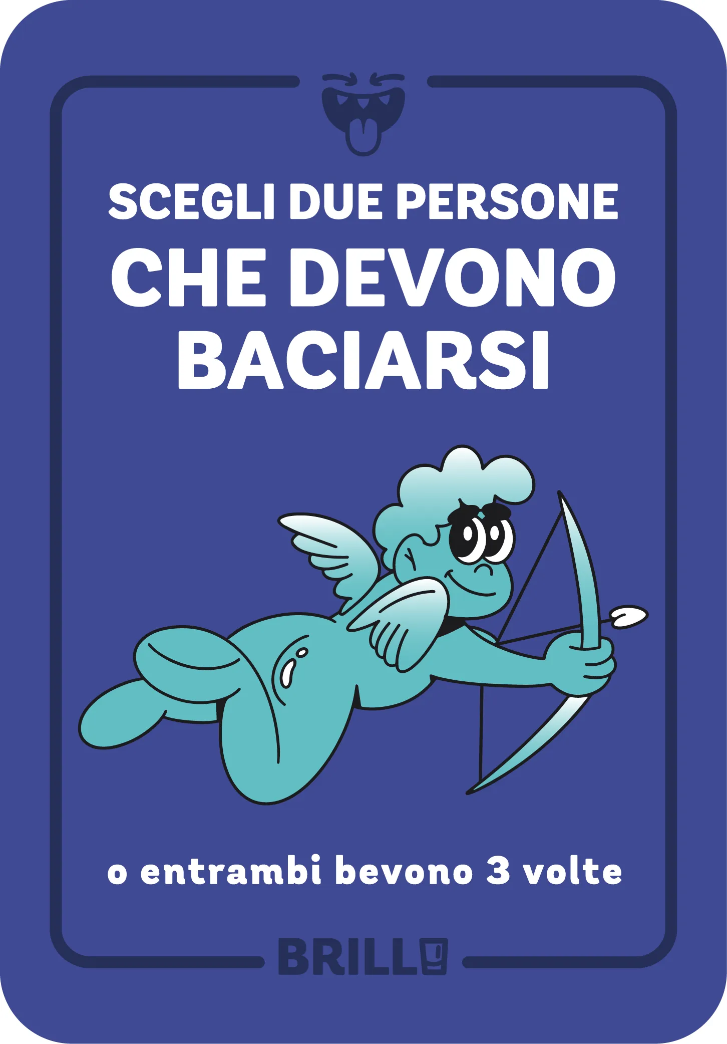
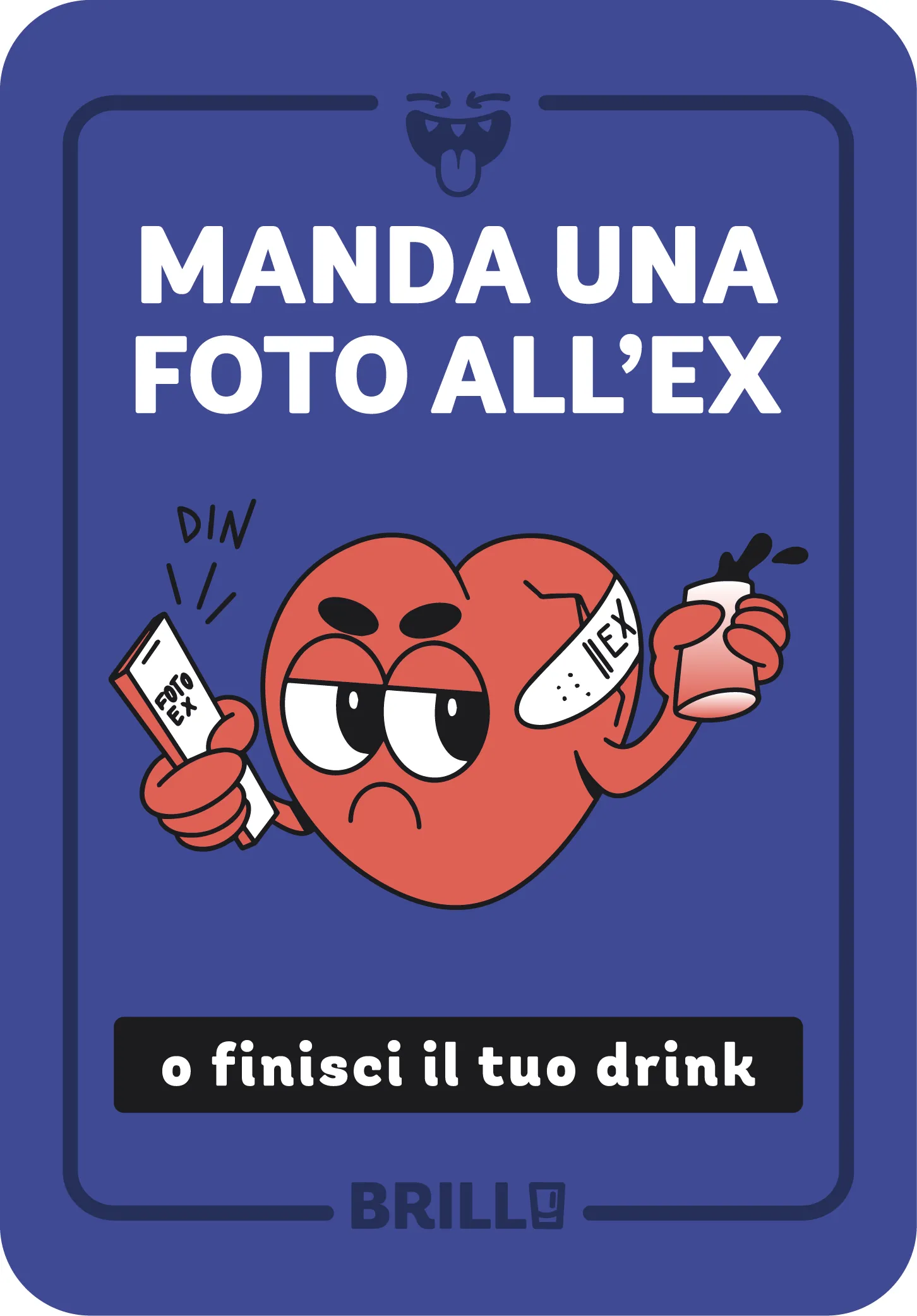
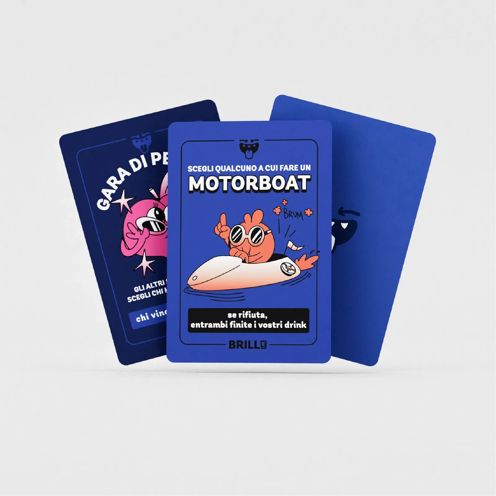
Blue is the dominant color of the deck, chosen to tie everything together. But the real stars are the contrasts: bold, colorful illustrations that pop off the cards, a high-impact typeface designed for clarity (even after a few drinks), and a dynamic layout that draws players in. Each card is crafted to be engaging, readable, and visually striking. The design doesn’t just support the gameplay, it amplifies it.


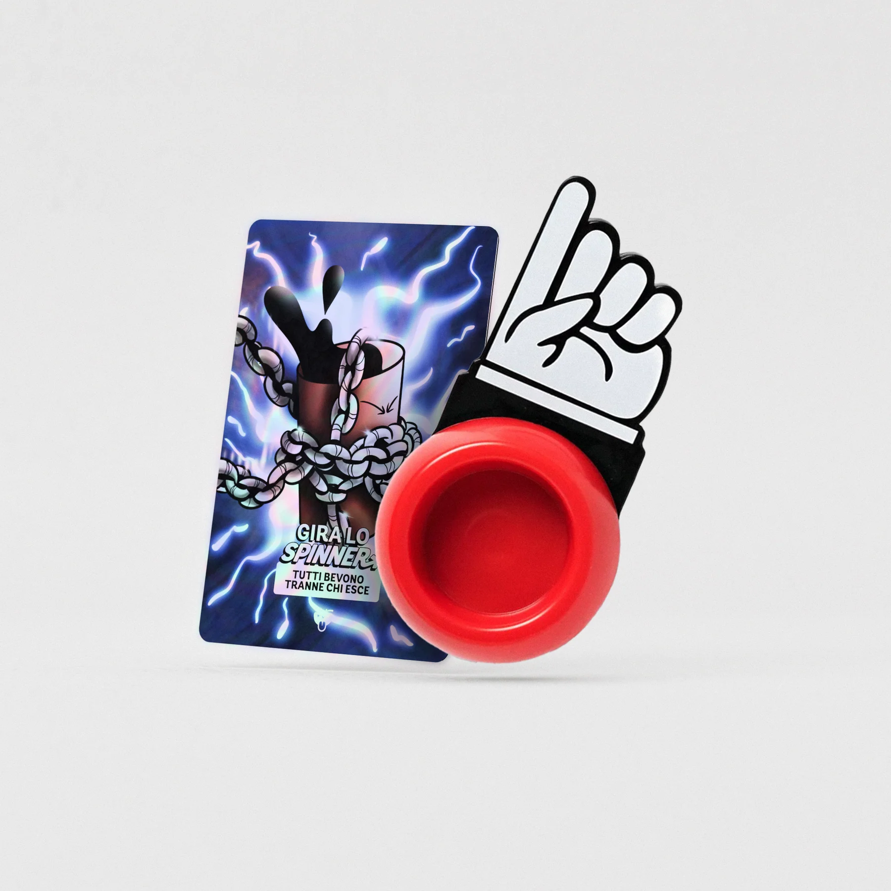
Spinner – special edition cards

After defining the core identity of Brillo, I had the opportunity to expand the project with a limited-edition upgrade: a set of special holographic cards, designed to add an extra layer of excitement to the game. These cards come with a custom spinner and introduce new collective challenges that shift the rhythm of the gameplay.